Simplification
App Design

Given the app’s place in popular culture as a trendy way to meet new people (and lovers), it is easy to assume how the name “Tinder” becomes relevant. Ho and Hou give insight to this, saying, “app icons with attractive design can increase the possibility of the app being noticed, and provide users with the motivation to browse more details of the app…” (2253). So, here we see the role of an attractive icon when put in a very competitive app store. Moreover, the icon’s bright, vibrant colors “…induce feelings of intimacy and interest in users” (Ho and Hou 2258). These are all good feelings that any app designer would want potential users to have, especially for an app possibly leading to romantic and/or sexual intimacy. Additionally, Lynch and Wysocki bring up a basic principle of marketing: it is designed to make people want products and want them fast (244). Thus, this effective semiotic scheme could bolster the app’s popularity.
Visual appeal is a tremendously important concept across the board when it comes to Tinder and even other apps. On this, Ho and Hou bring up the concept of kansei, which “refers to the psychological feelings and images consumers associate with new products (2254). Echoing this concept, Trachtinsky and Norman assert, “what is beautiful is usable” and that emotional design will play a notable role in future design (qtd. In Ho and Hou 2254). From my experience, Tinder is very pleasant looking; if anything, it was satisfying to look at the color scheme and excellent use of space for photos. A feeling like this is crucial to the success of an app: as Ho and Hou assert, “the first impression that people have towards an object is visual” (2254). Again, apps need to be visually appealing, which Tinder certainly is, thus leading to better impressions and user experience.
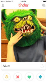
As many might know, digital design has long been based off of real-world objects. In explaining this practice, David Pogue asserts, “In the 1980s, to help the public make the transition to computers, Apple and Microsoft designers chose real-world shapes for on-screen icons to convey their meanings.” Tinder, while clearly displaying principles of newer flat design, integrates one important element of skeuomorphism: cards—a stack displaying potential lovers for users to sort. The “interesting” cards go to the right, while the “uninteresting” go to the left. This coincides with contemporary skeuomorphism. As David Pogue puts it, in effective circumstances, simple visual metaphors in design can quickly convey functionality. When seeing a deck of cards on Tinder, due to previous experience with touch screens, users (myself included) know to swipe. In my case, this implied the functionality of the app as a whole: it can be navigated almost completely by swiping. This simple application of skeuomorphism makes new users familiar with the app almost immediately. This pleasing effectiveness is highlighted by Nick Summers, stating, “Tinder feels like a game until you remember that the people behind those faces are swiping you back” (60).
Information

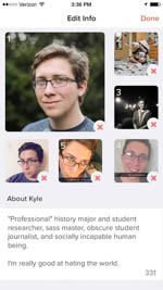
Due to this highly effective skeuomorphism, Tinder is able to present minimal, yet meaningful information: the app even goes so far as to avoid a newsfeed altogether. This is nonetheless purposeful: as asserted by Janel Torkington, “the problem with newsfeeds is information overload.” We can all attest to this—it is simply impossible to consume all of the content in one’s Facebook feed. Additionally, Twitter presents less due to a character limit, but the sheer quantity can still be overwhelming. With Tinder’s “card stack” strategy, information is used more effectively. As put by Torkington, “instead of information rendered useless by its vastness, cards connect with users by offering the best possible content, one piece at a time.” Users, myself included, can make better evaluations when presented with minimal information in small pieces: first impressions are only one photo, a person’s age, then their occupation or college. More information can then be obtained if a user is appealing based on this minimal information. Overall, as asserted by Tinder’s co-founder Sean Rad, “what we do on Tinder is no different than what we already do. You see somebody. You stare at their face. If you find a connection, you continue to understand, ‘what are our common interests, our social groups?’ You’re trying to create validation” (qtd. In Wilson). By simplifying information in the way it has, Tinder is mimicking the simple information of meeting someone in person, but with the ease of not having to physically take oneself to a public space and risk embarrassing oneself face-to-face. This will is more heavily covered in “Communication.”